Overview
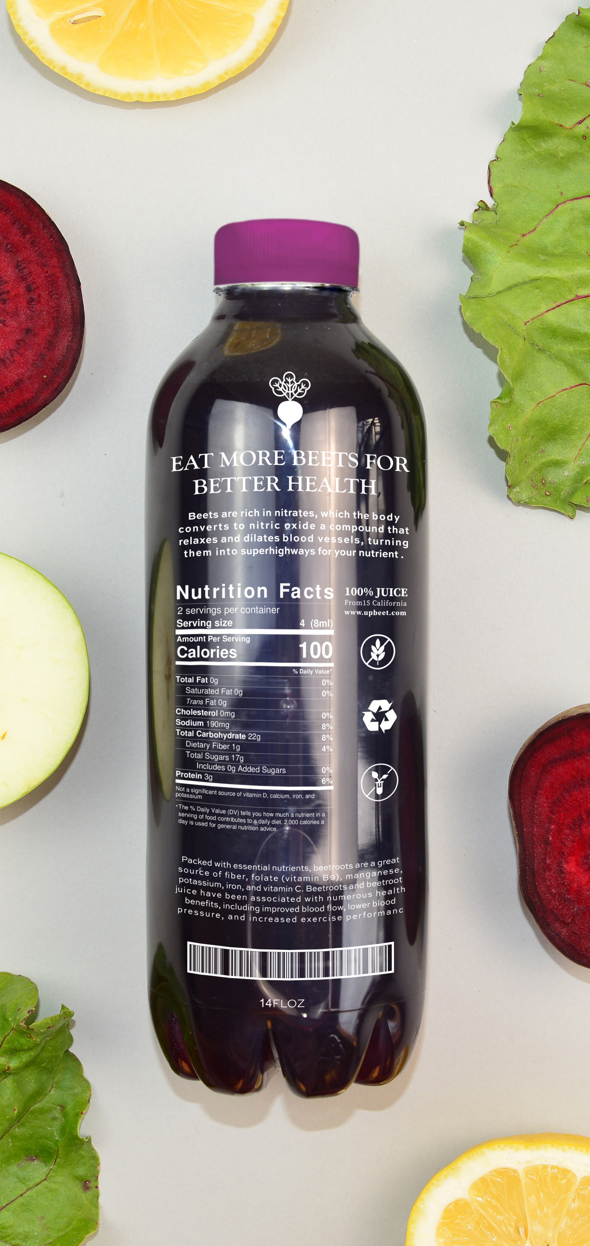
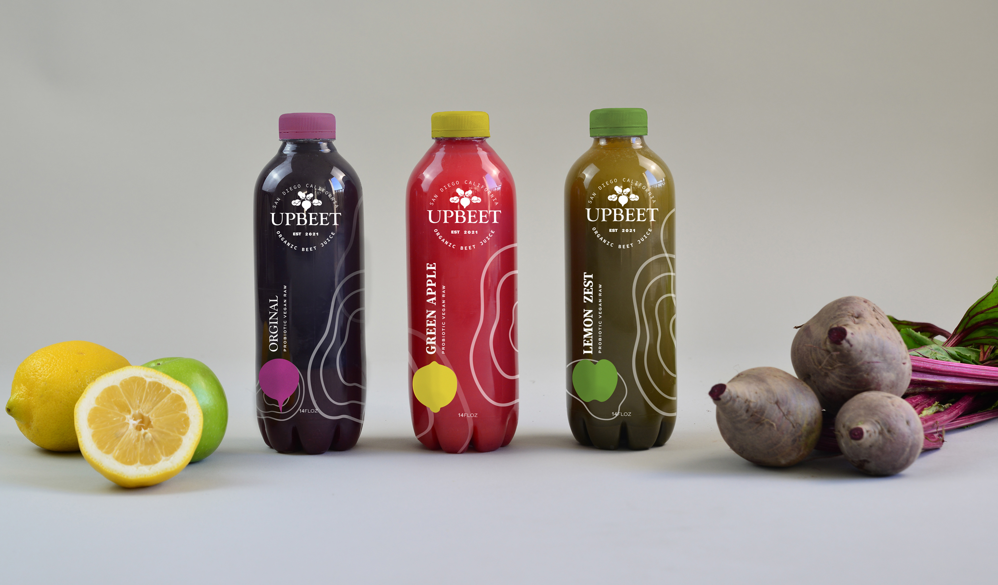
Beetroot, a wonderful vegetable, helps maintain good cardiovascular health. Machining healthy ingredients to reach the best natural taste to impress the target audience which is 30 to 45 Athletic people. The goal is to showcase the
Juice in a clear bottle and simple design.
Solution
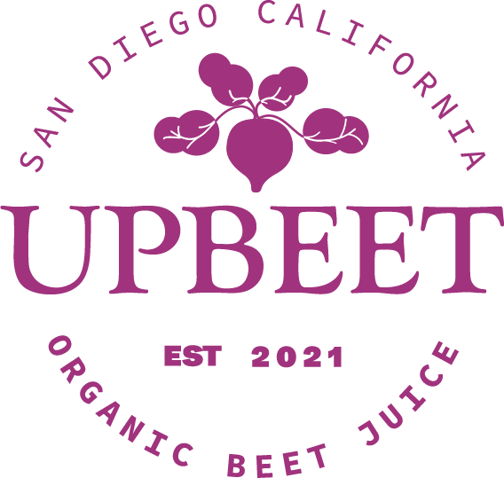
Choose The name Up Beet because of showcasing beet.
Simple illustrations of beets add a touch of differentiation to each bottle. Typography has an old-style vibe and a simple color palette along with organic flat shapes are used to promote the theme of health and wellness.
Category
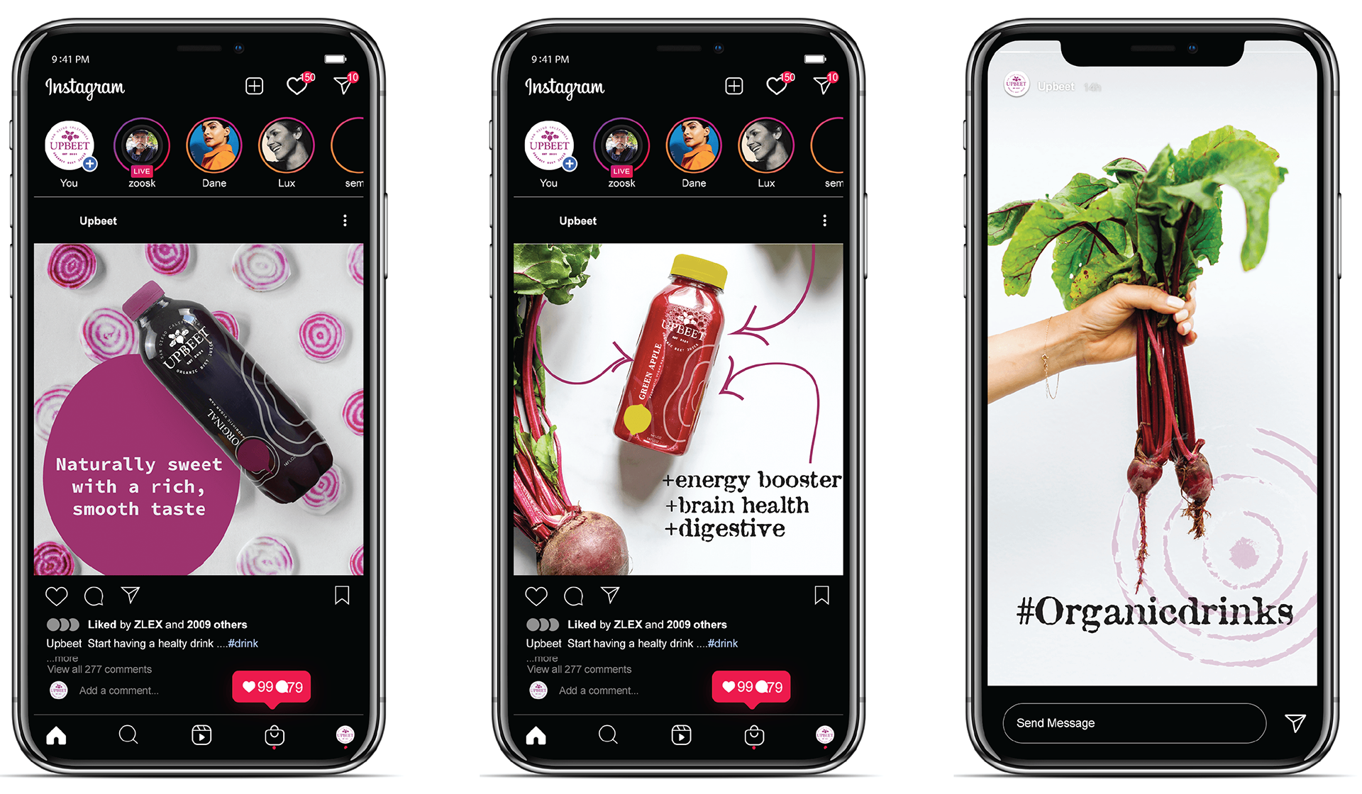
Packaging, Branding, print
Deliverables
Logo, Packaging, Photography
Art Direction
Bradford Prairie,
Typefaces
Goudy Old Style/Sweet Sans Pro
Completed
Dec 20, 2020