Overview
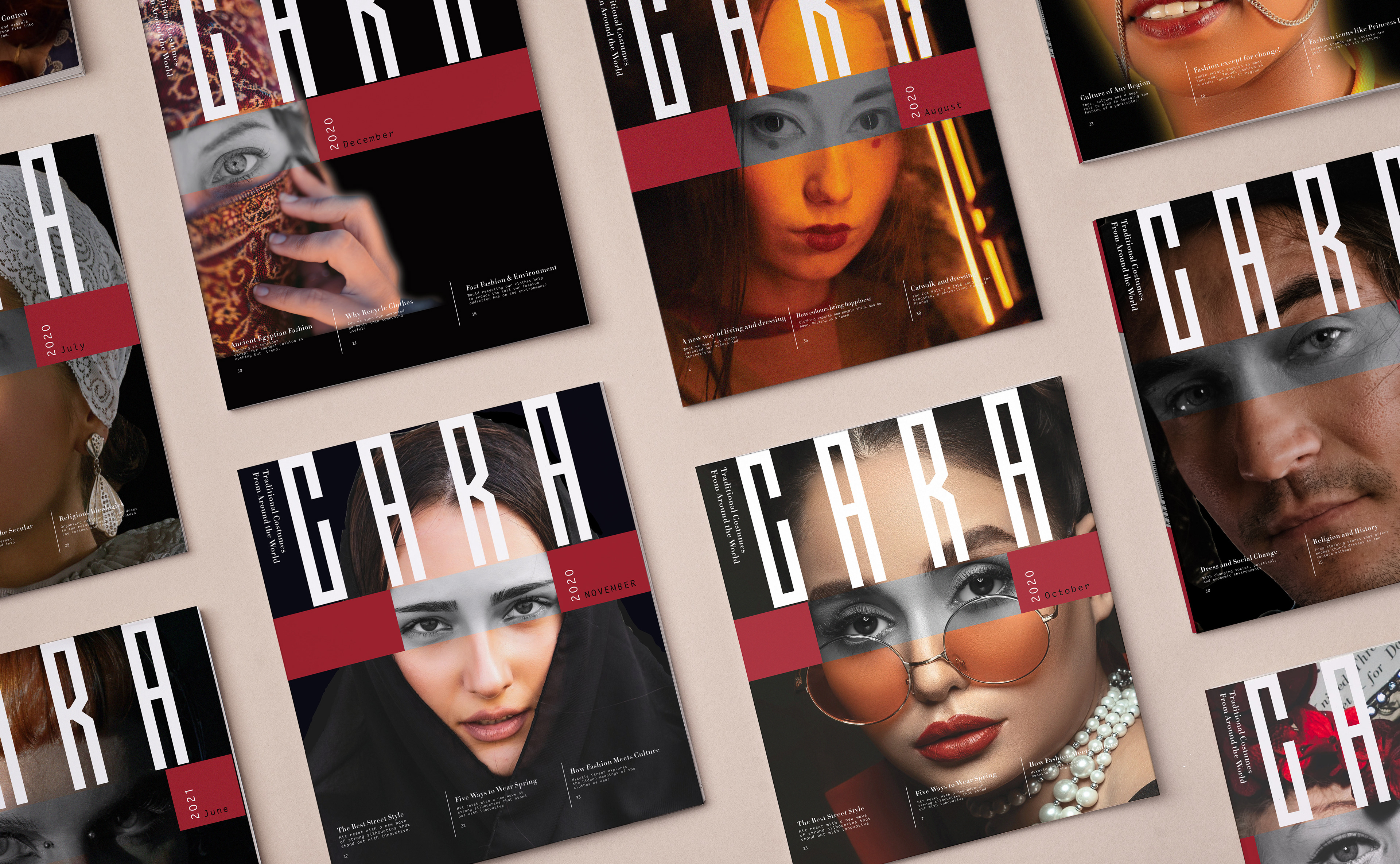
Gara is the magazine is about fashion and culture, the name comes from the Turkish language means black.The magazine mostly talks about how fashion is a very big part of culture and religion and how sometimes rules in many countries and mostly in the Middle East. The target audience is women 25 to 40.
Solution
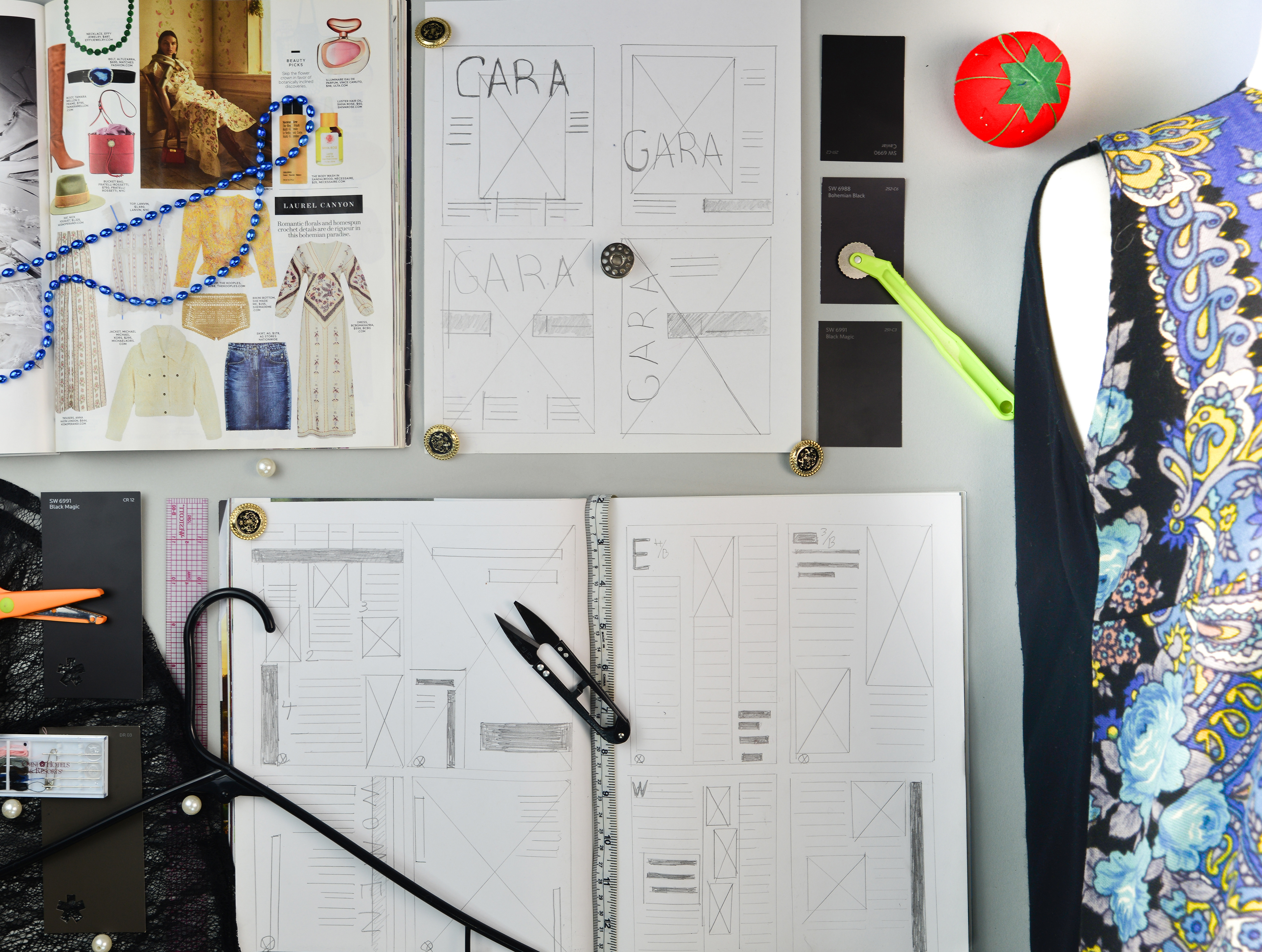
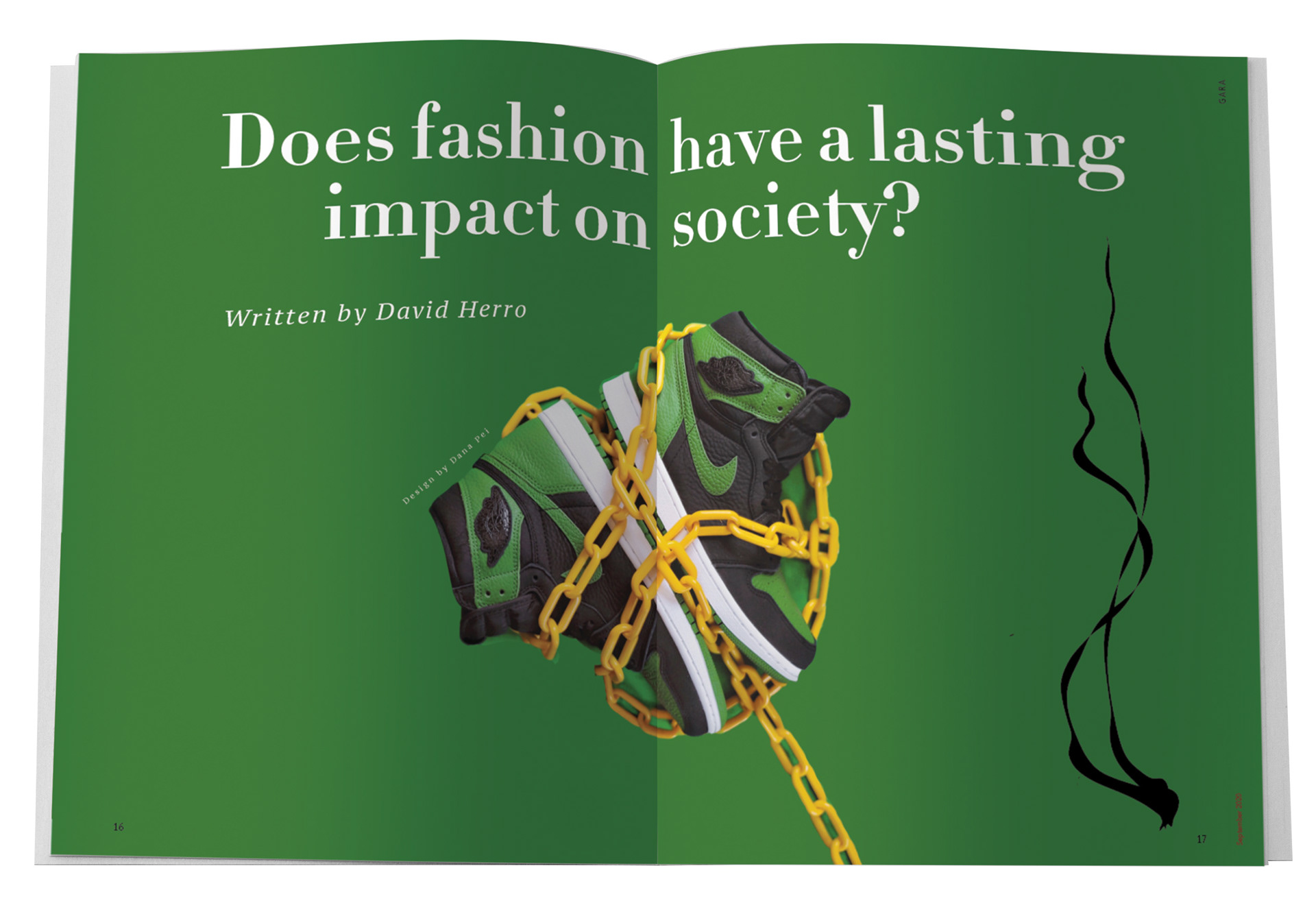
For the background color of the cover, I choose black to emphasize The Gara logo. The fusion of a geometric sans serif and highlighting eyes and red band is showing the restriction in cultures that hold fashion back in those countries. Given the fluidity of the magazine, mixing pt serif and pt mono to show fashion and class but with friendly taste.
Category
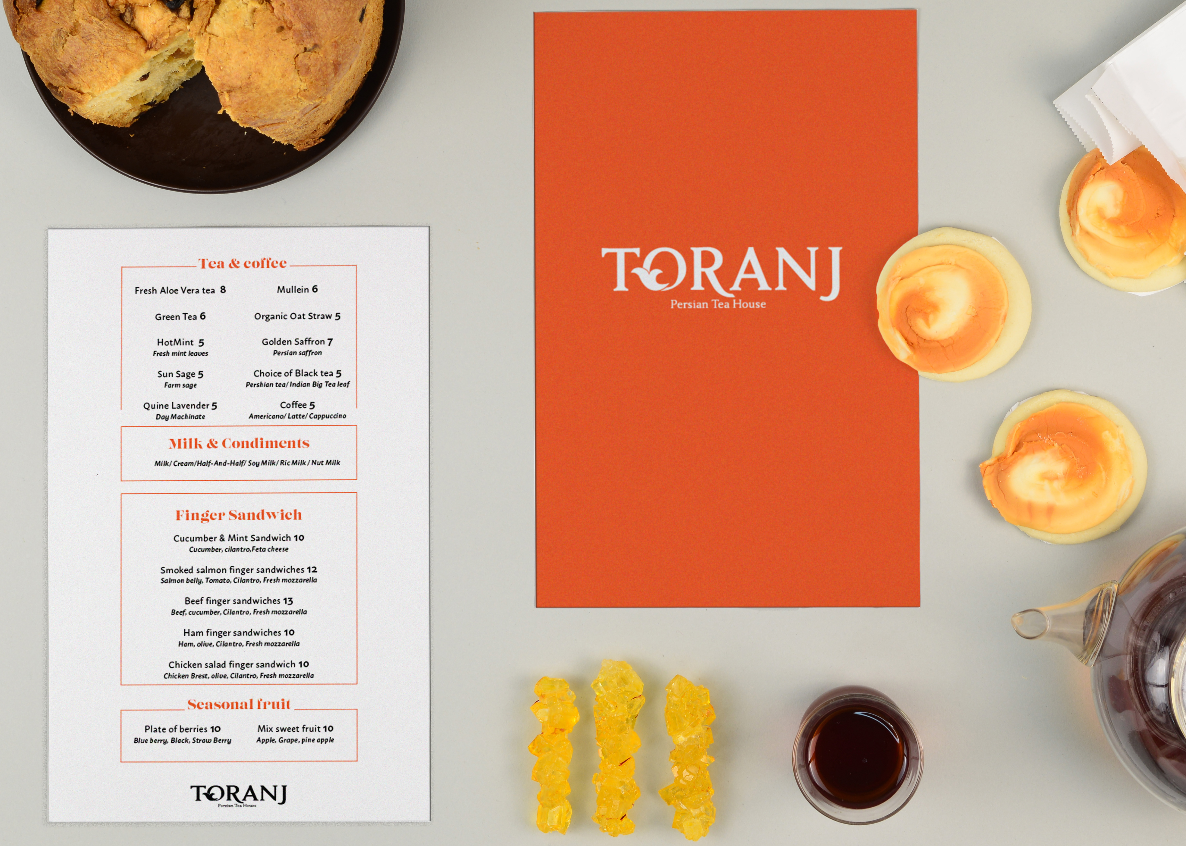
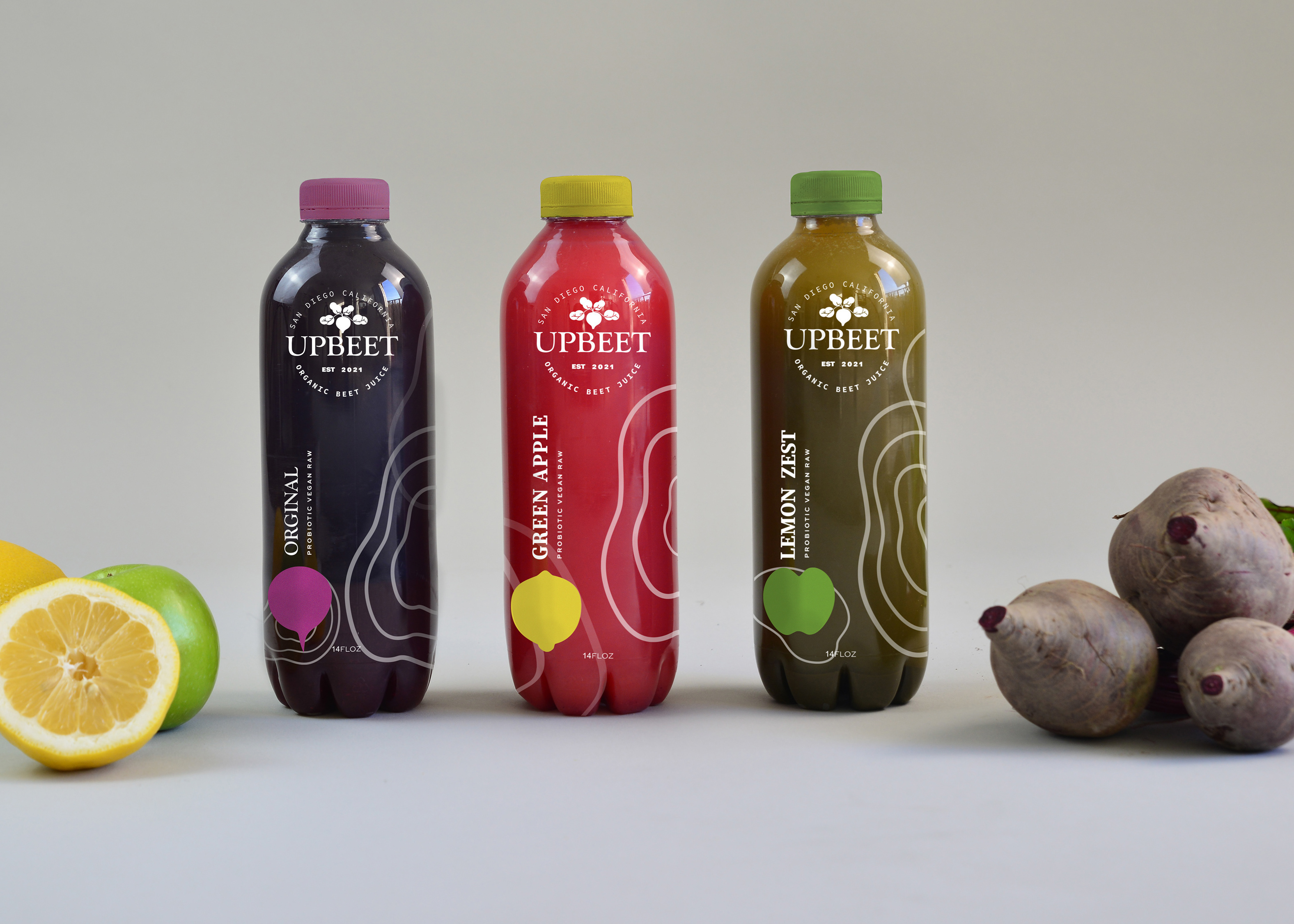
Packaging, Branding, print
Deliverables
Logo, Packaging, Photography
Art Direction
Min Choi
Typefaces
PT Serif, PT Mono, Didot HTF
Completed
Dec 20, 2020